Tactile & Human-Centered Design: Why Brands Are Moving Away From Hyper-Polished Minimalism in 2026

Tactile & Human-Centered Design: Why Brands Are Moving Away From Hyper-Polished Minimalism in 2026
Every brand's Figma file looks the same lately — soft gradients, rounded corners, generic sans-serif type, and an interface so frictionless it feels like it belongs to no one in particular. That sameness is exactly why audiences are starting to tune it out.
Tactile and human-centered design is gaining ground in 2026 precisely because hyper-polished minimalism has become a visual monoculture. When every product and brand chases the same sterile perfection, the ones that feel handmade, imperfect, and specific are the ones that actually get remembered.
This guide breaks down what's driving this shift, what tactile design actually looks like in practice, and how brands can adopt it without sacrificing the usability minimalism got right in the first place.
TL;DR — Quick Summary
Hyper-polished minimalism has become the default, which means it no longer differentiates — sameness has become its biggest weakness.
Tactile design reintroduces texture, imperfection, and materiality to make digital and physical brand experiences feel more human.
This shift isn't a rejection of usability — the best tactile design still respects clarity and function, it just adds warmth on top.
Micro-interactions, grain, and organic shapes are the most common entry points for brands testing this direction.
Human-centered design extends beyond visuals into tone of voice, imperfect photography, and less algorithmically-optimized content.
A design partner fluent in both discipline and craft can help brands adopt tactility without losing structural clarity.
Why Hyper-Polished Minimalism Stopped Working
Minimalism won for good reasons — it prioritized clarity, reduced cognitive load, and scaled beautifully across a growing number of screen sizes and platforms. The problem isn't minimalism itself; it's that nearly every brand adopted the exact same version of it.
Soft neumorphic shadows, identical rounded corner radii, and the same three "safe" color gradients now appear across categories as different as fintech, skincare, and productivity software. [Design sameness across digital products has become a widely observed trend among design researchers -> Link to Industry Data Source]
When a visual language becomes universal, it stops communicating anything distinctive about the brand using it.
The Cost of Looking Like Everyone Else
Sameness doesn't just hurt aesthetics — it actively undermines brand recall and emotional connection. A user who can't visually distinguish your product from three competitors has no reason to develop loyalty beyond price or convenience.
This is the exact vulnerability tactile and human-centered design is stepping in to address — not as a trend for its own sake, but as a genuine differentiation strategy.
What Tactile Design Actually Means in Practice
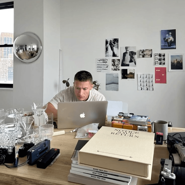
Tactile design isn't a rejection of digital polish — it's the reintroduction of texture, warmth, and specificity into interfaces that had become clinically smooth. Think grain overlays, hand-drawn illustration accents, organic shapes, and typography with genuine character rather than default system fonts.
The goal is an experience that feels considered and specific to one brand, rather than assembled from the same component library every competitor is using.
Core Elements Defining the Tactile Aesthetic
Subtle grain and texture overlays that add depth without sacrificing legibility
Organic, imperfect shapes replacing uniform rounded rectangles across cards and buttons
Editorial typography choices — serif accents, expressive display type — layered against clean functional text
Physical material references — paper, fabric, ceramic textures — translated into digital surfaces
Done well, this doesn't compromise usability; it adds emotional texture on top of a still-clear interaction model. This is the exact balance we aim for in every product and brand design project — craft layered onto genuine functional clarity, not instead of it.
Human-Centered Design Beyond the Visual Layer
Tactility isn't only about texture and shape — it extends into tone, content, and the small imperfections that make a brand feel like it was made by people, not generated by a template. Overly polished stock photography and algorithmically-safe copy are just as much a symptom of the sameness problem as visual minimalism.
Brands leaning into human-centered design are increasingly choosing imperfect, candid photography over airbrushed stock imagery, and conversational copy over corporate-safe messaging.
Where This Shows Up Across a Brand Experience
Photography that favors genuine, slightly imperfect moments over polished studio staging
Copywriting that sounds like a specific person, not a generic brand voice template
Micro-interactions with subtle, characterful motion rather than purely functional, invisible transitions
Packaging and physical touchpoints that reintroduce material texture lost in years of minimalist "clean" packaging trends
This philosophy runs through everything from brand identity systems to the smallest interaction details in a product interface — consistency of feeling, not just consistency of color codes.
Why This Shift Matters More for Digital-First Brands
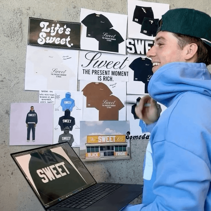
Digital-first and D2C brands are especially exposed to the sameness problem, since so much of their visual identity was built using the same handful of no-code tools and component libraries. A brand built entirely in a templated site builder often looks structurally identical to dozens of competitors using the same theme.
This is precisely why tactile, human-centered design has become a genuine competitive advantage for digital-native brands specifically — it's one of the few remaining ways to visually differentiate within tool constraints most competitors share.
The Risk of Overcorrecting Into Chaos
It's worth noting that tactile design done poorly just trades one problem for another — texture for texture's sake, without restraint, reads as cluttered rather than intentional. The best tactile design still applies the disciplined hierarchy minimalism taught the industry; it just adds warmth and specificity on top of that structure.
Brands considering this shift should treat it as an evolution of design discipline, not a license to abandon clarity altogether. If you're unsure where your current brand sits on that spectrum, a focused brand and UI audit is a useful starting point before committing to a full redesign direction.
How to Introduce Tactile Design Without a Full Rebrand
Adopting this aesthetic doesn't require tearing down an entire brand system overnight. Most brands can introduce tactile elements incrementally, testing where texture and warmth add value without disrupting core usability.
A Practical Rollout Sequence
Start with typography and photography — often the fastest, lowest-risk entry points for adding character
Introduce texture in secondary surfaces — backgrounds, section dividers, packaging inserts — before touching primary UI components
Test micro-interactions on a single high-visibility flow before rolling new motion language across the entire product
Gather qualitative feedback, not just quantitative metrics, since tactile shifts often affect perceived brand warmth more than raw conversion numbers initially
This staged approach lets a brand validate the direction before committing the entire design system to it, which is a far lower-risk path than a single sweeping rebrand.
What This Trend Signals About Consumer Expectations in 2026
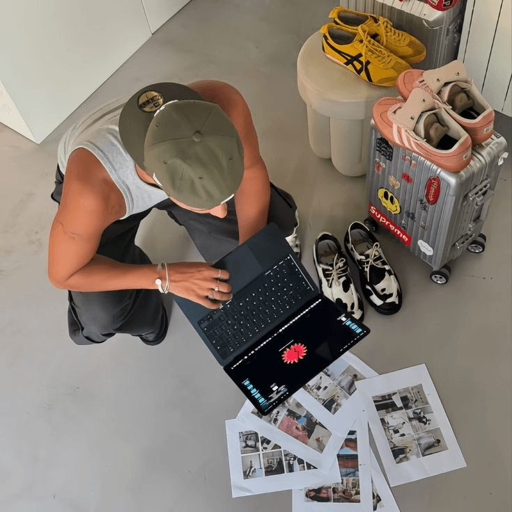
This shift reflects something broader than a design trend cycle — it tracks a documented consumer preference shift toward authenticity across marketing and product experiences generally. [Consumers increasingly favor brands perceived as authentic over those perceived as highly polished or corporate -> Link to Industry Data Source]
Tactile design is, in many ways, the visual expression of that authenticity preference — texture and imperfection read as evidence of a real creative decision, rather than an algorithmically-optimized default.
Why This Isn't Likely to Be a Short-Lived Trend
Design trends tied purely to aesthetics tend to cycle quickly, but this shift is tied to a deeper structural cause: the oversaturation of minimalist tooling has made true minimalism a commodity, not a differentiator. That underlying condition isn't going away, which suggests tactile and human-centered approaches have real staying power rather than being a brief stylistic detour.
Brands that adopt this direction thoughtfully now are likely to feel ahead of the curve for several years, rather than chasing a trend that peaks and fades within a single season.
Final Thoughts: Craft Is Becoming the Differentiator Again
For the better part of a decade, minimalism served as an effective shortcut to looking "clean" and "modern" — but shortcuts, by nature, get adopted by everyone eventually. The brands standing out now are the ones reintroducing genuine craft, texture, and human specificity on top of the usability lessons minimalism taught the industry.
This isn't a call to abandon clarity or function — it's a call to layer real design taste back on top of it, at a moment when taste itself has become the scarce resource. Founders who recognize this shift early have a genuine window to differentiate before tactile design becomes its own new visual monoculture.
If your brand currently looks like it was assembled from the same template as everyone else in your category, that's worth addressing before the gap widens further. specializes in exactly this kind of considered, tactile design work — for founders who want their brand to feel unmistakably like their own, not another instance of the same minimalist default.